Your Interface Isn't Broken. It's Indistinguishable.
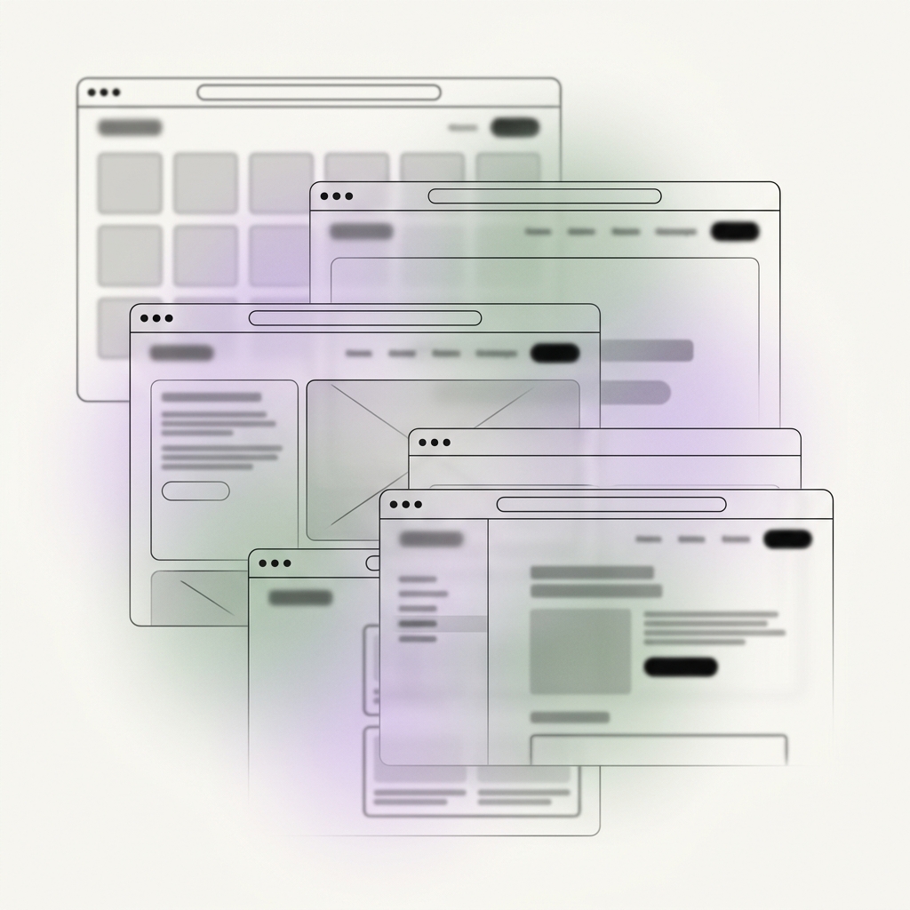
Open five SaaS products in your space. Blur the logos. They start to look the same. Design has become predictable — not because teams lack talent, but because everyone is optimizing against the same references.
Marcus Rivera
APSLOCK
The Convergence Problem
Open five SaaS products in your space.
Blur the logos.
They start to look the same.
Clean grids. Soft shadows. Rounded buttons. Safe typography.
Nothing is wrong with any of it.
That's the problem.
Design has become predictable. Not because teams lack talent—but because everyone is optimizing against the same references.
"Best practices" didn't just standardize usability.
They standardized identity.
When every product feels familiar, users don't choose—they default. And default decisions rarely build loyalty.
The Metrics Blind Spot
Most teams don't notice this drift.
They measure:
—Task completion
—Click-through rates
—Usability scores
All green.
Meanwhile:
—Recall drops
—Differentiation fades
—Switching costs shrink
Because usability tells you if something works.
It doesn't tell you if it matters.
The Smoothness Trap
We've quietly equated good design with invisible design.
The smoother the experience, the less the user feels it.
The less they feel it, the less they remember it.
That's not user-centric.
That's neutral.
There's a difference between removing friction and removing character.
Broken flows? Fix them.
Confusing navigation? Fix it.
But beyond that, total smoothness becomes a tradeoff.
If every interaction is predictable, nothing stands out.
If nothing stands out, nothing sticks.
Where Products Converge
Look at where most products converge:
—Same onboarding patterns
—Same dashboard layouts
—Same micro-interactions
—Same tone of voice
It's not coincidence.
It's convergence.
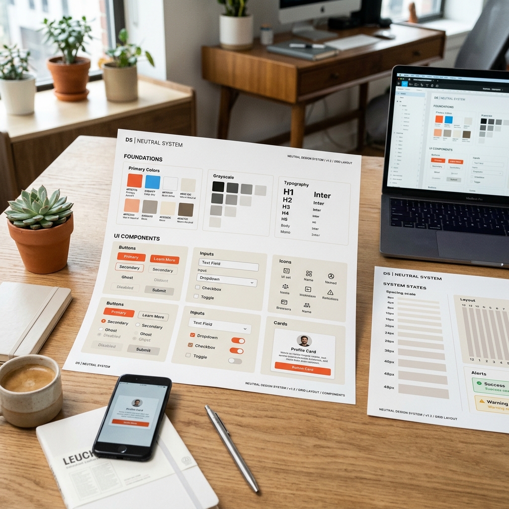
Design systems made teams faster.
They also made outcomes similar.
The Shift
The shift isn't about rejecting usability.
It's about deciding where not to be generic.
Not everywhere. Just where it counts.
A moment in onboarding that signals personality.
Copy that sounds like a human, not a system.
A visual decision that feels intentional, not safe.
Small signals. Big effect.
Because users don't remember flows.
They remember moments.
The Harder Question
Ask a harder question:
If your UI was stripped of branding, would anyone know it's yours?
If the answer is no, your design isn't user-centric.
It's reference-centric.
Good design gets you used.
Distinct design gets you chosen.
There's a difference.
Don't just make your product easy to use.
Make it impossible to confuse with anything else.
Written by
Marcus Rivera
Part of the APSLOCK team — building digital experiences that don't just work, but matter.
Keep reading